
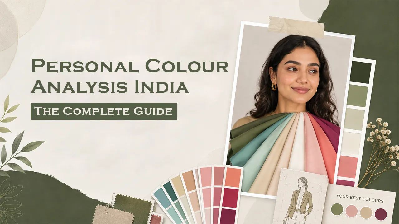
There’s a particular kind of confusion most of us have felt while shopping: a top looks stunning on the hanger, disappointing in the mirror, and you can’t quite explain why. More often than not, the answer isn’t the cut or the fabric. It’s the colour, and whether it works with your natural colouring or against it.
That’s the exact problem personal colour analysis solves. It’s not a beauty trend or a passing social media filter. It’s a structured, visual method of identifying which colours make your skin look luminous, your eyes brighter and your overall presence more polished, and which colours quietly work against you. In India, where skin tones range across an unusually wide spectrum, from porcelain to deep espresso, often within the same family, colour analysis is arguably more useful here than almost anywhere else in the world.
This guide breaks down everything you need to know: what colour analysis actually is, how undertones and colour seasons work, how it applies specifically to Indian skin, and how to decide between doing it yourself or working with a professional.
The Everyday Struggle: Why Most of Us Are Dressing Blind
If any of this feels familiar, you’re not alone:
- You buy a colour because it looks great on someone else, or on a mannequin, and it falls flat on you.
- Your wardrobe is full of clothes you rarely wear because something about them makes you look tired, dull or older than you are, and you can’t put your finger on why.
- You default to black, white or beige for “safety,” even though you secretly want to wear colour with more confidence.
- Compliments seem to cluster around a handful of outfits, but you’ve never been able to figure out the common thread.
- Festive and wedding shopping feels stressful because bold Indian colours either look stunning or slightly off, with no clear pattern.
- Makeup shades that work perfectly on influencers or in-store testers look strange once you actually apply them.
None of this is about taste or effort. It’s almost always about undertone mismatch, and it’s the single most common styling frustration our image consulting clients bring to their first session. Once you understand your undertone and colour season, this guesswork disappears, and getting dressed stops being a daily gamble.
What Is Personal Colour Analysis?
Personal colour analysis is a method of identifying the colours that best complement your natural skin undertone, eye colour and hair colour, so that your clothing, makeup and accessories enhance your features rather than fight with them.
The concept originated from colour theory research in the mid twentieth century and was later organised into “season” systems (more on this below) that are still used by image consultants and stylists today. At its core, colour analysis is not about what’s fashionable or what suits your body type. It’s purely about which hues make your complexion look healthiest and most vibrant, and which ones cast unflattering shadows, dullness or sallowness on your skin.
The result is usually a personalised colour palette: a curated set of shades that consistently work for you, across clothing, makeup, hair colour and even accessories like jewellery and eyewear.
How Does Personal Colour Analysis Work?
Colour analysis works through a process called draping: holding different coloured fabrics up against your face, under neutral lighting, and observing how each one affects your skin’s clarity, the brightness of your eyes and any shadows or discoloration that appear.
A trained eye (or increasingly, a trained eye supported by digital tools) looks for specific, consistent shifts:
- Does the fabric make your skin look brighter, or does it flatten and dull your complexion?
- Does it reduce the appearance of dark circles, redness or unevenness, or exaggerate them?
- Does your face appear more lifted and defined, or do your features recede?
- Do your eyes appear brighter and more prominent, or washed out?
This isn’t a subjective styling opinion. It’s a fairly consistent, repeatable visual test. Two different consultants draping the same person with the same fabrics will usually arrive at very similar conclusions, which is part of why the method has held up for decades.
Understanding Undertones: Warm, Cool and Neutral
Before you can understand colour seasons, you need to understand undertone, because undertone is the foundation the entire system is built on.
Undertone is different from skin tone. Skin tone is how light or deep your complexion is (fair, wheatish, medium, deep). Undertone is the subtle hue beneath the surface of your skin that stays constant regardless of tan lines, sun exposure or seasonal changes.
There are three broad undertone categories:
- Warm undertones have golden, peachy or yellow hues beneath the skin. Warm toned individuals typically look best in earthy, golden based colours such as mustard, terracotta, olive green, warm reds and camel.
- Cool undertones have pink, red or bluish hues beneath the skin. Cool toned individuals tend to shine in jewel tones and blue based colours such as sapphire, emerald, true red and icy pastels.
- Neutral undertones sit between the two, with a balanced mix of warm and cool. Neutral toned individuals often have the widest flexibility, though even neutral undertones lean slightly warm or cool on closer analysis.
Quick Ways to Identify Your Undertone
A few commonly used, though imperfect, home indicators:
- Vein test: Bluish or purple veins on your wrist typically suggest cool undertones; greenish veins suggest warm undertones. Blue green or hard to tell veins often indicate neutral.
- Jewellery test: If gold jewellery makes your skin glow but silver looks slightly harsh, you likely lean warm, and vice versa for cool.
- White vs cream test: If bright, stark white flatters you more than soft ivory or cream, you likely lean cool. If the reverse is true, you likely lean warm.
These tests are useful starting points, but none of them are conclusive on their own, which is exactly why professional draping exists. Undertone is genuinely difficult to self diagnose accurately, especially under artificial lighting or with camera colour distortion.
Colour Seasons Explained
Once undertone is established, colour analysis typically maps you into one of four broad seasons: Spring, Summer, Autumn or Winter, each further divided into sub-seasons in more advanced (12 season or 16 season) systems.
| Season | Undertone | Best Known For | Signature Colours |
| Spring | Warm | Bright, fresh, high clarity | Coral, warm yellow, apple green, turquoise |
| Summer | Cool | Soft, muted, gentle contrast | Dusty rose, powder blue, lavender, soft grey |
| Autumn | Warm | Rich, deep, earthy | Rust, olive, mustard, chocolate brown |
| Winter | Cool | Bold, high contrast, saturated | True red, emerald, black, icy white |
The 12 season system refines this further, for example splitting Autumn into “Soft Autumn,” “True Autumn” and “Deep Autumn” based on additional factors like depth (how light or dark) and chroma (how bright or muted). This level of precision is where professional analysis genuinely outperforms a generic online quiz.
Personal Colour Analysis for Indian Skin Tones
This is where most Western origin colour analysis content falls short, and where it matters most to get right.
Indian skin tones are exceptionally diverse, often spanning fair, wheatish, olive, tan and deep complexions within a single family. Two people with a similar depth of skin tone can have entirely different undertones, and higher melanin content changes how colours visually interact with skin in ways the standard Western frameworks don’t always account for.
A few India-specific realities worth understanding:
- Depth and undertone are separate. A deep complexioned person can be warm, cool or neutral. Depth of skin tone tells you nothing about undertone on its own. This is one of the most common misconceptions in India, where colour advice is often given based on “fair vs dusky” rather than actual undertone.
- Melanin rich skin often carries higher colour saturation beautifully. Jewel tones, deep jewel adjacent shades and rich earth tones tend to look exceptionally striking on medium to deep Indian skin tones, a nuance general colour guides rarely highlight.
- Festive and bridal wear changes the stakes. Indian wardrobes lean heavily on strong, saturated colour: reds, golds, jewel tones and festive prints, making undertone accuracy even more important than in wardrobes built around neutrals.
- Gold vs silver jewellery preference is a genuinely useful India specific cue, since gold jewellery is worn so widely here that most people already have an intuitive sense of whether it flatters them.
This is precisely why a generic international quiz or a one size fits all colour chart tends to underperform for Indian clients. The analysis needs to be trained on, and sensitive to, Indian skin’s tonal range.
Clothing, Makeup and Accessory Recommendations by Undertone
Once your undertone and season are identified, the same logic extends across your entire look.
Clothing: Your everyday wardrobe, formal wear and ethnic wear should all draw from your personal palette, not as a rigid rule, but as a reliable default when you’re unsure. Warm toned individuals generally do well in gold based, jewel toned fabrics and earthy festive colours; cool toned individuals often gravitate toward silver based tones and jewel bright festive colours.
Makeup: Foundation undertone matching prevents the greyish or ashy cast that happens when warm toned makeup is applied to cool skin, or vice versa. Lipstick and blush shades follow the same warm and cool logic: coral and terracotta tones for warm undertones, berry and rose tones for cool undertones.
Accessories: Metal tone matters more than most people realise. Warm undertones are typically flattered by gold, rose gold and bronze; cool undertones by silver, platinum and white gold. This single adjustment often has an outsized visual impact.
Once you know your palette, applying it consistently, from your work wardrobe to your festive edit, is where services like Wardrobe Curation & Personal Shopping and Grooming Essentials & Everyday Makeup come in, since they build directly on your colour profile.
DIY vs Professional Colour Analysis: Which Should You Choose?
DIY colour analysis (online quizzes, self draping with fabric swatches, AI based apps) is a reasonable starting point if you’re colour curious and want a rough direction. It’s free or low cost and gives you a general sense of warm vs cool.
However, DIY analysis has real limitations:
- Lighting and camera colour accuracy heavily distort results for photo based tools.
- Self assessment is prone to bias; we tend to see what we expect once we’ve formed an idea of our undertone.
- Nuance (soft vs true vs deep seasons) is nearly impossible to self diagnose without training.
- Indian skin’s undertone diversity makes generic international quiz results particularly unreliable.
Professional colour analysis, done in person with a trained consultant under neutral lighting, offers:
- Accurate, consistent draping under controlled conditions
- Trained interpretation of subtle undertone and depth cues
- A tailored palette specific to your exact colouring, not a generic season bucket
- Practical guidance on applying the palette to clothing, makeup and festive wear
If you’re simply curious, a DIY quiz is a fine first step. If you’re investing in your wardrobe, personal brand or professional image, a professional consultation delivers meaningfully more accurate and more usable results, which is why most experienced image consultants recommend it as the starting point for any real styling work.
What to Expect From a Professional Colour Analysis Consultation
A professional session typically follows a structured process:
- A short conversation about your lifestyle, wardrobe goals and any colours you’ve always struggled with or wondered about.
- Draping, using a curated set of fabric swatches held against your face under neutral, consistent lighting. This is the core diagnostic step.
- Undertone and season identification, based on how your skin, eyes and overall complexion respond to each drape.
- A personalised colour palette, translating the analysis into a practical, usable set of shades for clothing, makeup and accessories.
- Guidance on application: how to use the palette while shopping, dressing for work, festive occasions or building a more intentional wardrobe going forward.
How Grace & Growth’s Personalised Colour Analysis Can Help
At Grace & Growth, Personalised Colour Analysis is one of our signature image consulting services, led by founder Mansi Mehta and designed to give you a colour profile that genuinely aligns with your undertone, energy and the way you want to be perceived, whether that’s in the boardroom, on a first date or at a family wedding.
Rather than handing you a generic seasonal chart, the process is built around your actual colouring, accounting for the tonal range and nuance common to Indian skin, and translated into a palette you can confidently use across your wardrobe, makeup and accessories.
(Grace & Growth input required: please confirm the specific methodology or framework used, such as 4 season, 12 season or a proprietary system; any certifications held in colour analysis or image consulting that should be cited for credibility; whether client testimonials specific to colour analysis can be added; and any measurable outcomes or before and after examples that can be referenced.)
If you’ve ever stood in front of a packed wardrobe feeling like nothing quite works, a personalised colour analysis session might be the single most useful hour you spend on your image this year.
Ready to discover your palette? Book your Personalised Colour Analysis consultation with Grace & Growth today and start dressing with clarity, not guesswork.
Frequently Asked Questions
1. What is personal colour analysis and how does it work?
Personal colour analysis is a method of identifying which colours best complement your natural undertone, skin tone and eye colour, using a technique called draping, which involves holding fabric swatches against your face under neutral lighting to see which shades enhance your complexion.
2. How do I know if I have a warm or cool undertone?
Common home indicators include vein colour (greenish veins suggest warm, bluish veins suggest cool), how gold vs silver jewellery looks against your skin, and whether stark white or soft cream flatters you more. These are useful starting points, but professional draping gives a far more accurate result.
3. Is colour analysis different for Indian skin tones?
Yes. Indian skin spans an unusually wide range of depth and undertone, and depth (how fair or deep your skin is) is separate from undertone (warm, cool or neutral). Generic international colour quizzes often don’t account for this, which is why India specific analysis tends to be more accurate.
4. Can I do colour analysis myself, or do I need a professional?
DIY quizzes and self draping can give a rough general direction, but they are limited by lighting, camera distortion and self assessment bias. A professional consultation, done under controlled neutral lighting by a trained consultant, delivers significantly more accurate and nuanced results.
5. What colours should I avoid if I have a warm undertone?
Warm undertone individuals generally find that stark, icy or blue based cool colours, such as true blue, fuchsia or icy pastels, can wash out their complexion, while golden, earthy and warm based shades tend to be more flattering.
6. How long does a professional colour analysis consultation take?
7. Does personal colour analysis change as I get older?
Your underlying undertone generally stays the same throughout life, since it’s determined by natural pigmentation rather than external factors. However, hair colour changes (such as greying), skin texture shifts, or significant tanning can affect how certain shades read against your face, which is why some people choose to revisit their palette every few years.
8. Can two people with the same skin colour have different colour seasons?
Yes, and this is one of the most misunderstood aspects of colour analysis. Skin colour (how fair or deep) and undertone (warm, cool or neutral) are two separate factors. Two people with identical depth of skin tone can belong to completely different colour seasons depending on their underlying undertone.
9. Will personal colour analysis tell me what to wear for weddings or festive occasions?
Yes. A good colour palette applies to festive and bridal wear just as much as everyday clothing. Since Indian celebrations often involve strong, saturated colours like red, gold and jewel tones, knowing your undertone helps you choose shades within those categories that genuinely suit you, rather than guessing.
10. Is personal colour analysis only about clothes, or does it apply to makeup and hair colour too?
It applies to all three. The same undertone principles that determine which clothing colours suit you also guide foundation shade matching, lipstick and blush tones, and even whether warm or cool based hair colours will look most natural against your skin.
11. How is personal colour analysis different from a general style or fashion consultation?
Colour analysis focuses specifically on undertone and which hues flatter your complexion. A broader style or wardrobe consultation typically builds on that colour palette while also addressing body shape, proportion, personal style preferences and lifestyle needs. Many clients start with colour analysis and then move into wardrobe curation once their palette is established.